loader

TOKEE

Developed a cohesive visual system for TOKEE, aligning brand identity, digital presence, and communication. The project focused on clarity, consistency, and scalability across brand touchpoints.

  • CLIENT XGREEN GROUP
  • YEAR 2026
  • CATEGORY BRAND

RESEARCH

As a startup project, TOKEE required a broad and hands-on approach from the very beginning. Research focused on understanding the product, market, positioning, and constraints, allowing fast, informed decisions across brand, structure, and communication.
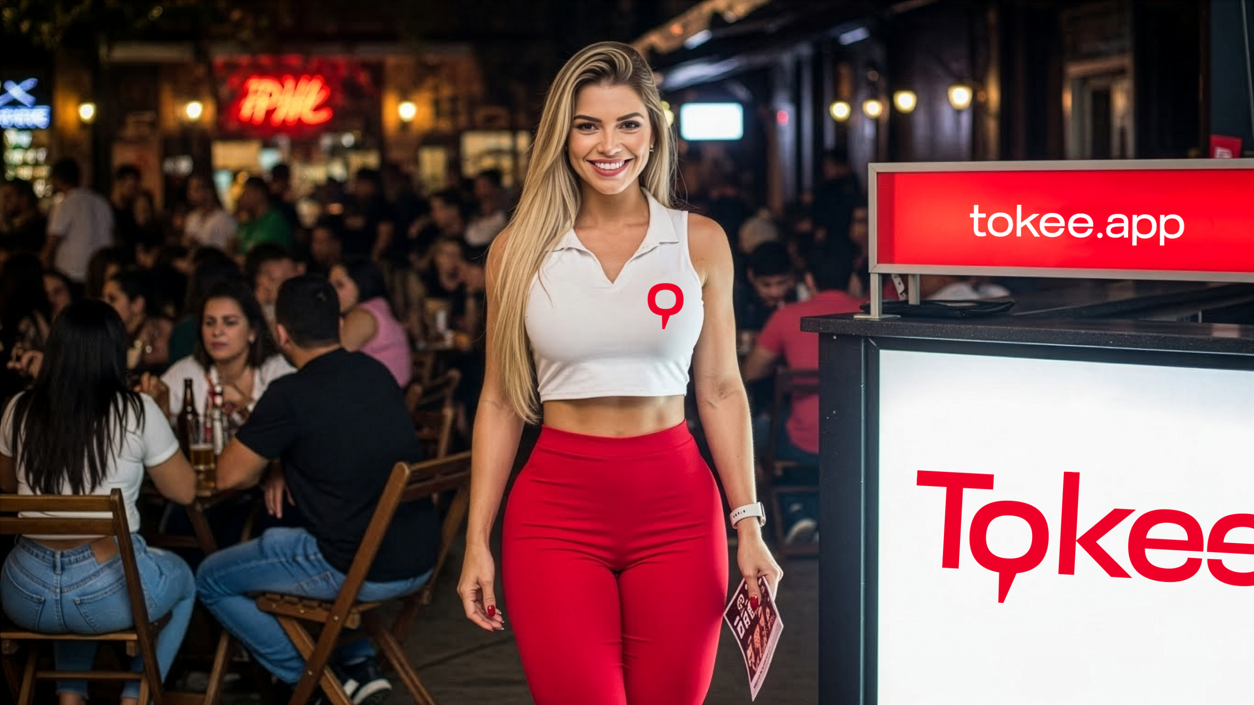
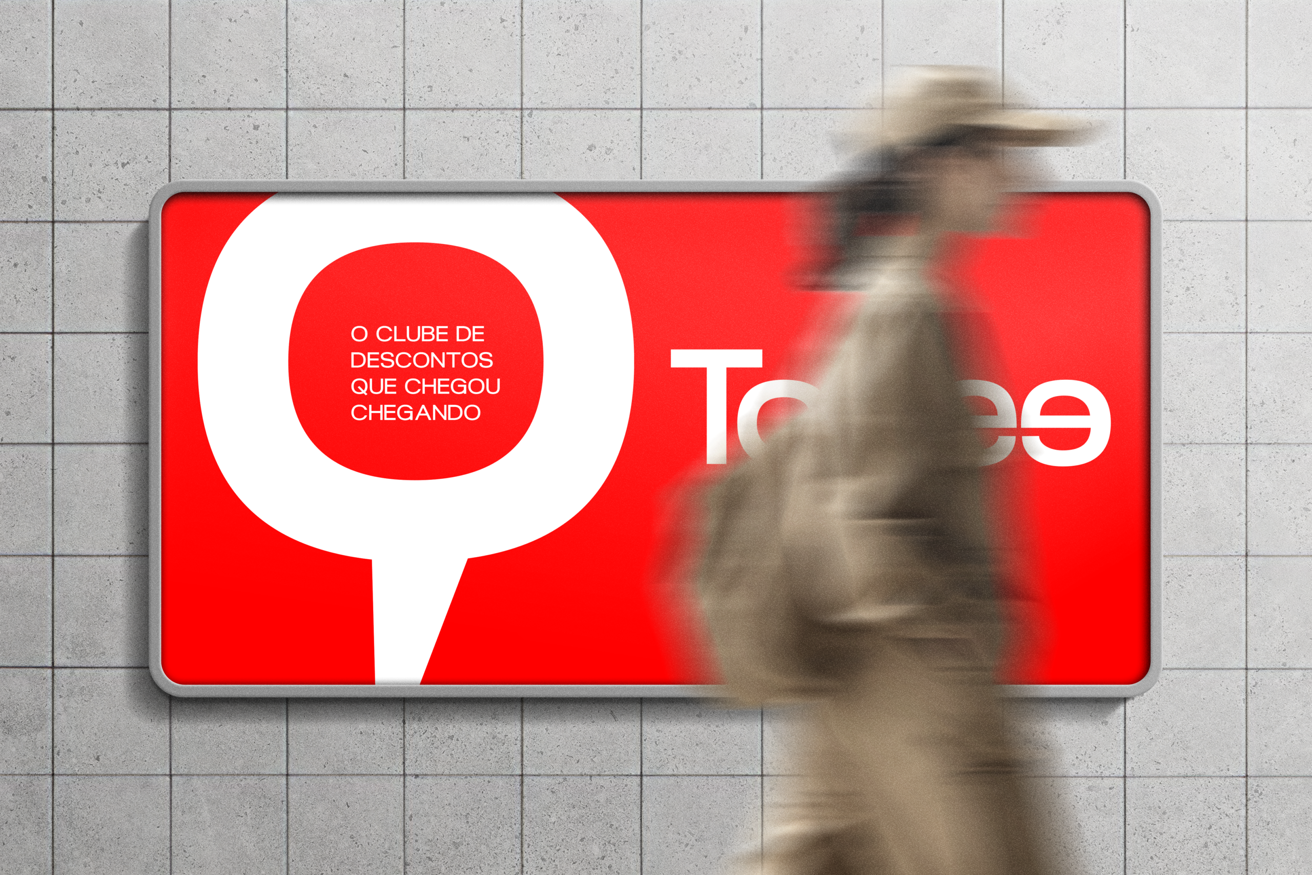
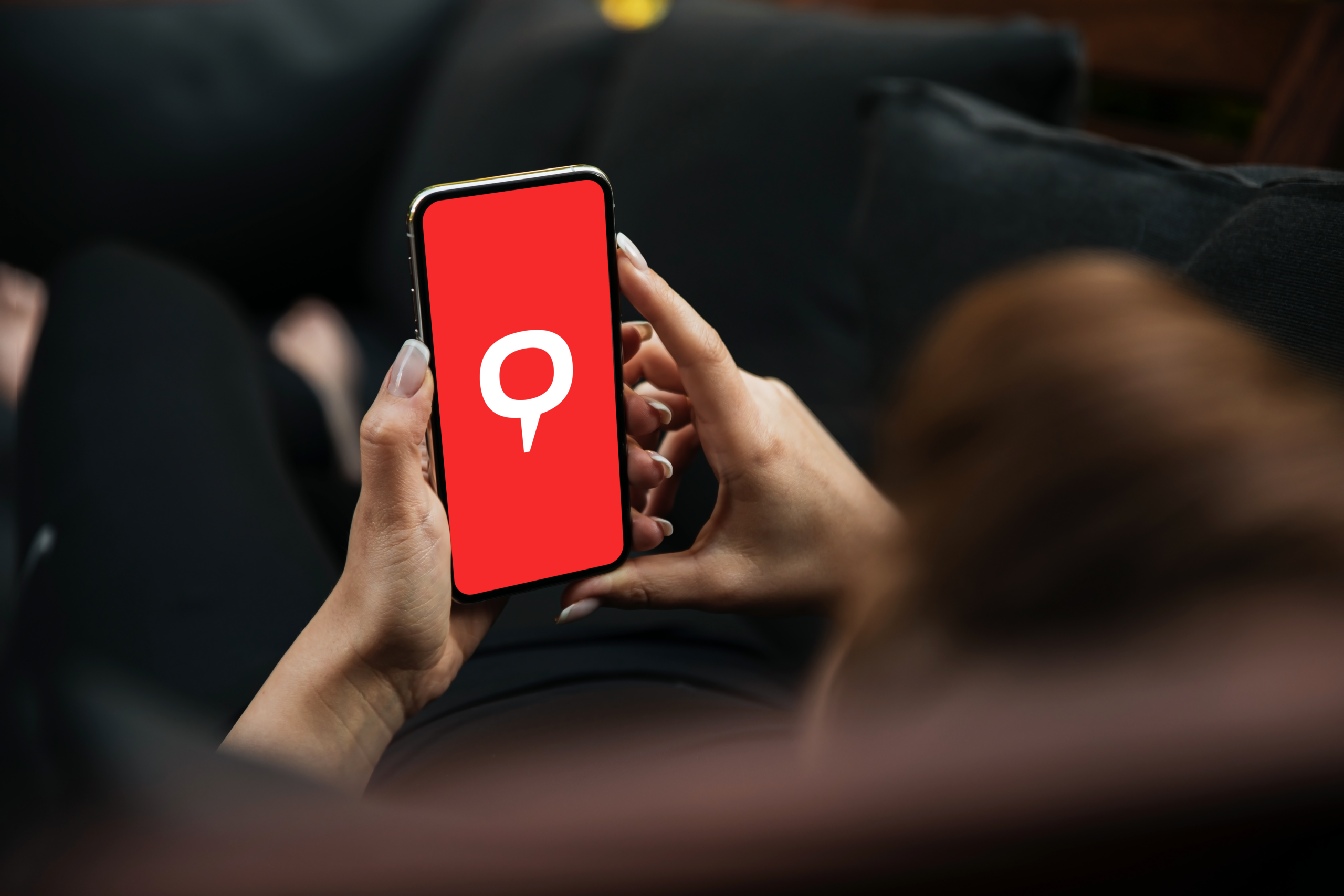
DESIGN

Design was approached end-to-end, with every decision impacting the system as a whole. From brand identity to digital applications, the focus was on building a flexible, consistent visual system capable of evolving alongside the product.

CONCEPT

The concept reinterprets the location pin, a familiar identification element in mapping apps, as a central brand symbol. A shift from navigation to identity.

  • MORE WORKS MORE WORKS
  • MORE WORKS MORE WORKS
  • MORE WORKS MORE WORKS
  • MORE WORKS MORE WORKS