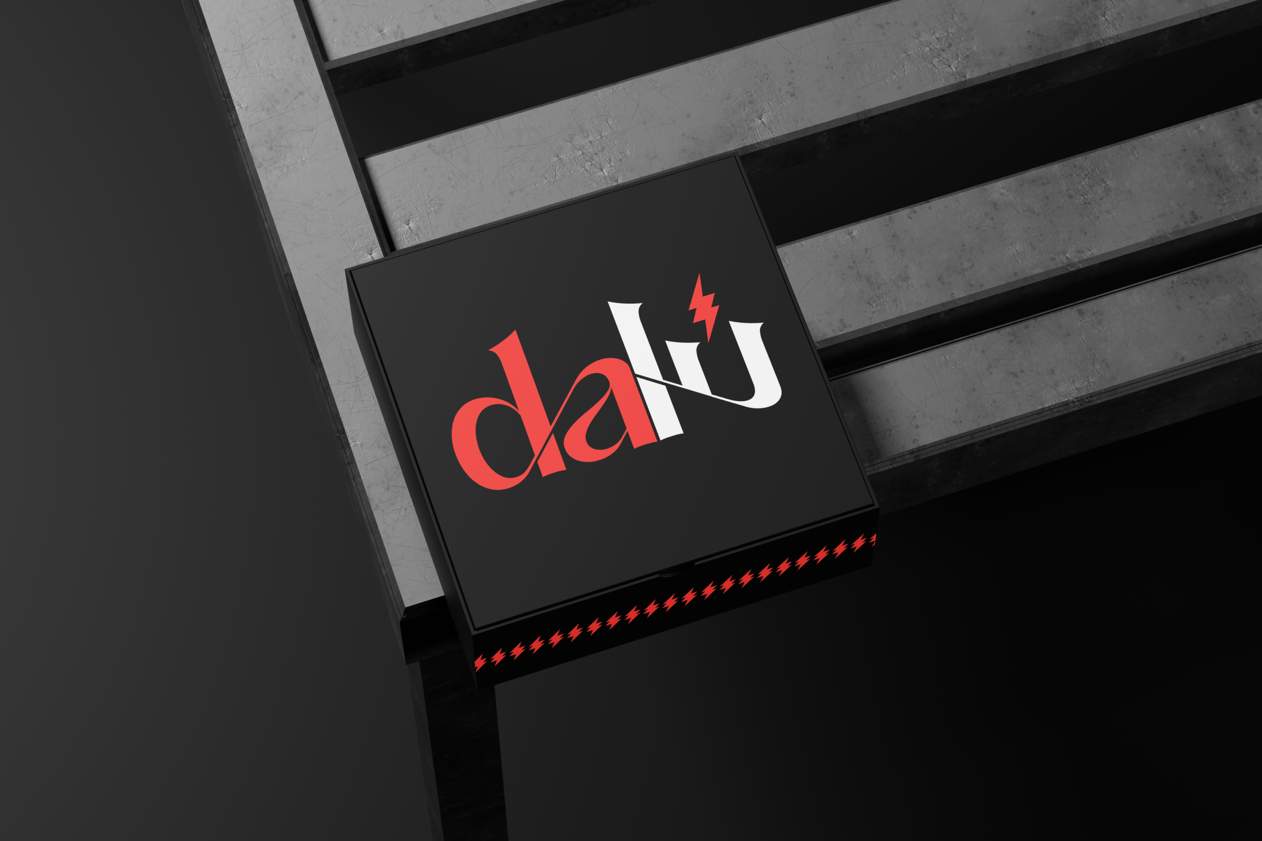
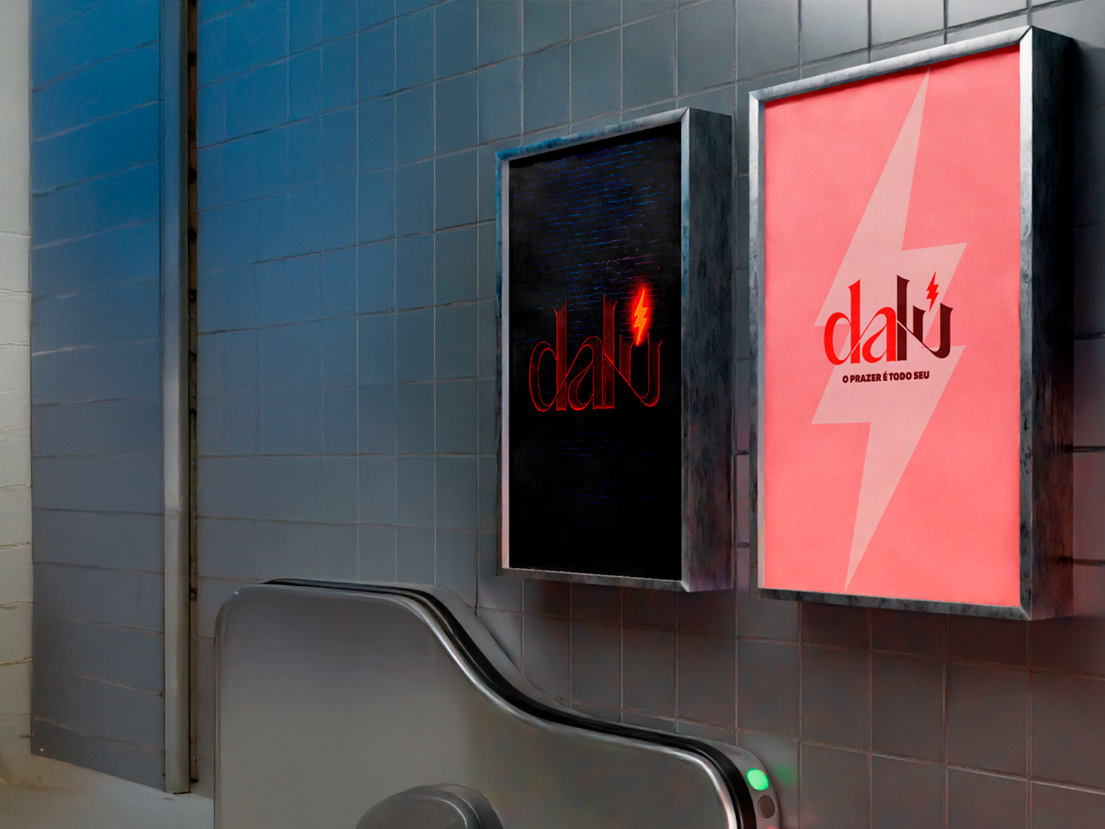
RESEARCH
The research phase focused on understanding Lumena Aleluia’s public trajectory, audience perception, and the tensions between visibility, judgment, freedom, and self-care.
Beyond references and benchmarks, the process involved mapping symbols, narratives, and emotional territories connected to autonomy, sensuality, and self-ownership — identifying how the brand could communicate strength without falling into stereotypes or overexposure.
DESIGN
The visual identity was designed to balance boldness and restraint.
Typography, contrast, and composition were carefully defined to express confidence, clarity, and intention — allowing the brand to be sensual without being obvious, powerful without being aggressive.
The system was built to be flexible, supporting different layers of Lumena’s presence while maintaining visual coherence and symbolic strength.
SYSTEM
DALU’s visual system was designed to grow alongside Lumena’s journey.
Rather than a static identity, the brand operates as a living structure — capable of adapting to new narratives, formats, and moments while preserving its symbolic foundation and visual integrity.